Vegetables Font Review
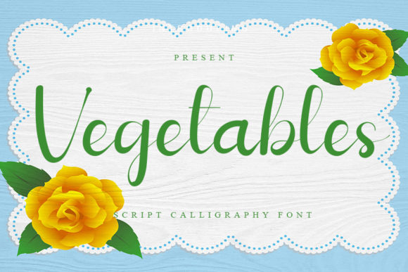
As a web designer, I’m always on the lookout for fonts that bring personality and clarity to digital projects. Vegetables, part of the Script Amp collection, caught my eye with its elegant script style. I tested it across several layouts—hero sections, buttons, and headings—and found it to be a standout choice for creative websites.
First Impressions: A Refined Script
Vegetables has a soft, flowing feel that feels both modern and timeless. It’s not overly ornate, but it carries enough detail to stand out in a design. The strokes are clean, and the curves give it a refined, almost handcrafted quality. It works well for titles, logos, and decorative elements where a touch of elegance is needed.
I used it on a boutique online store’s hero section, where it added a sense of sophistication without overwhelming the layout. The font pairs well with minimalist backgrounds, letting it shine as a focal point.
Web Usability: When to Use and When Not To
Vegetables is best suited for short phrases, headlines, and display purposes. It excels in areas like call-to-action buttons, section headers, and logo text. However, it’s not ideal for long paragraphs or dense body copy. Its decorative nature can reduce readability when used in larger blocks of text.
On mobile screens, I noticed that the font holds up well at larger sizes, but smaller text—like navigation links or form labels—can become hard to read. For those cases, pairing it with a clean sans serif font like Open Sans or Lato makes sense.
Designing for Brand Identity
When building a brand identity, consistency is key. Vegetables offers a unique voice that can help define a brand’s tone. I used it in a coaching website’s header, where it complemented the site’s warm, approachable vibe. The font added a personal touch without being too flashy.
It also worked well in a course sales page, where it was used for the main headline. The contrast between the script font and a simple body font created a clear visual hierarchy, guiding users through the content smoothly.
Responsive Design and Visual Hierarchy
Testing Vegetables on different screen sizes showed that it adapts well to responsive layouts. On desktop, it looked sharp and polished. On mobile, it maintained its legibility at appropriate sizes. I placed it over image banners and found that it didn’t clash with the background, thanks to its subtle weight and spacing.
For visual hierarchy, I used it as a heading on a blog redesign project. It stood out against the body text and helped break up content into digestible sections. The font’s natural flow made it feel more engaging than a standard sans serif.
Font Pairing: Finding the Right Balance
One of the strengths of Vegetables is how well it pairs with other typefaces. In a portfolio website, I paired it with a bold sans serif for the main navigation. This combination gave the site a modern, professional look while keeping the design cohesive.
Another time, I used it alongside a classic serif font for a blog’s title and subheadings. The contrast brought a timeless feel to the site, perfect for a lifestyle or editorial-focused platform.
Practical Tips for Web Designers
If you’re planning to use Vegetables in your next project, here are a few tips. First, check the available styles—Vegetables likely includes multiple weights or alternates that can add variety to your designs. Second, make sure the font is available as a webfont (like WOFF or WOFF2) if you're using it on a live site.
Also, consider the licensing. If you're using it for commercial projects or client work, ensure that the license covers your intended use. Finally, test it in different contexts—dark mode, light mode, and image overlays—to see how it performs in real-world scenarios.
Overall, Vegetables is a versatile and stylish font that brings a touch of class to any digital project. Whether you're designing a landing page, a portfolio site, or a brand identity, it’s worth considering for its visual appeal and usability in the right contexts.